Translation
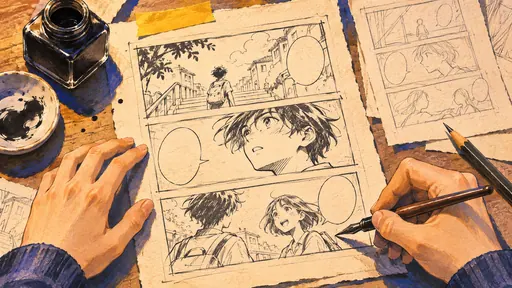
The work behind a manga speech balloon
A translation has to carry a character’s voice, fit in the drawing, and pass the reader’s eye to the right place on the page.
A single line has more than one job
Imagine a character catching a friend opening a cupboard they were told to leave alone. “What are you doing?” and “Seriously?” could both express the situation, but they give the character different voices. One makes them sound like they want an answer. The other suggests they already understand the problem. A translator looking at the drawing and the pages around it can use the expression, relationship and timing to choose what works.
Repeated terms create another problem over a long story. A school nickname that sounds ordinary in one chapter can become the core of a later joke. Spellings, character titles and recurring forms of address benefit from being tracked in a series glossary. That leaves room for the translator to be flexible in the individual line while keeping names and relationships recognizable.
Lettering moves the reader through the scene
An English phrase can take a very different amount of space from the original. Picture a compact balloon next to someone’s eye. Growing the text until it touches the border takes the pause out of the drawing, while shrinking it too far makes readers leave the panel to zoom. Line breaks, balloon shape and the space around the text change how quickly you see the line. They’re choices for a letterer as well as the translator.
Sound effects are another case where you can see the decision. A page might retain an effect as part of the artwork and add a small translation nearby. Another edition might redraw it in the new language. Consider whether the effect functions like background noise or an action you need to notice immediately. That helps explain why a publisher might treat two effects differently on the same page.
Try comparing two editions of the same page
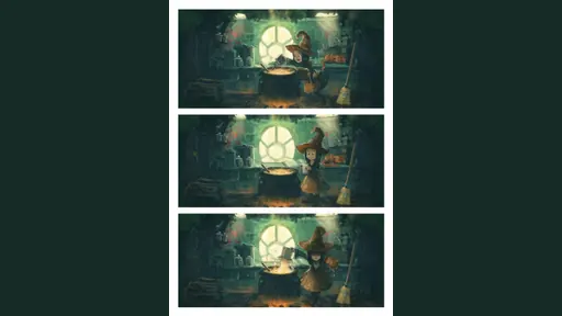
David Revoy publishes the art and lettering as separate files for Pepper&Carrot. The page above shows the art for “The Potion of Flight.” Open the creator’s source page and switch languages to compare the same drawings with different text. You can see where a translation needs a different line break and how much of the artwork stays visible under the lettering.
For a commercial manga example, VIZ’s Fullmetal Alchemist Fullmetal Edition advertises updated translation and fresh lettering. Choose a short exchange you remember and compare where your eye stops, when the reaction comes into view, and how a recurring name looks in each printing.